How to get full marks in IB Economics graphs
If you really want to understand IB Economics, you need to know your way around the different graphs involved. In this detailed blog post, Jenny (our lead IB Economics tutor) talks you through everything you could ever need to know!
Diagrams – the key to getting high and full marks in your IB Paper 1 and Paper 2
As you know, we love to use economic models to depict the theory in a more simplistic way, of course holding certain variables constant (ceteris paribus) so that it does not get too complicated. Drawing a diagram does not sound too hard and thus you might not want to take the time to practice drawing a detailed labelling diagram. I mean how much time does it really take to draw a neat, clear, applied and labelled diagram – one or two minutes max?
Well, let’s say that two minutes works. In your IB Economics Paper 1 (essay paper), it is recommended that you draw at least one diagram in a part a) question (10 marks) and two to three diagrams in a part b) question (15 marks). In your IB Economics Paper 2 (data response paper), you can be asked to draw diagrams for a part b) and a part c) question (both worth 4 marks) as well as the part d) question (8 marks). So, if we now do a little math check here, this would bring us to approximately 8 minutes of drawing for a Paper 1 and a Paper 2 question. Of course, in total you have 45 minutes to answer an essay or a data response question so 8 minutes on diagrams might sound ok but it means that you must be on the spot and confident about drawing the most relevant, applied, accurate and labelled diagram.
Drawing the most relevant, applied and labelled diagram is also significant for your internal assessment (IA) which is worth 20% of your final IB grade. Moreover, every diagram that you draw must be fully explained to get to Level 2 (Paper 2) and at least Level 3 (Paper 1 and your IA). This means that you
you should be technical and explain the most important elements of your diagrams. This usually involves the following:
What to pay attention to when drawing:
1. Always, always, always try to include a diagram in your Paper 1 or Paper 2 answer, even if it is not necessarily stated in the question.
2. Draw neat and precise diagrams so ALWAYS use a ruler and clear pen. Always label your axis clearly with a clear given example (good or service or country reference)
3. Always label the original situation e.g. equilibrium (Pe/Qe) and the new situation e.g. new equilibrium (P1/Q1)
4. Use arrows to show any change e.g. demand or supply shifts or Pe to P1 price level changes or Y1 to Yfe
5. Make your diagrams clearly visible so try not to include small drawings/ diagrams
What to pay attention to when explaining:
6. Explain clearly the original situation with reference to original equilibrium or elasticity of curves or type of diagram (Keynes or Neo-classical)
7. Explain the reason for change e.g. identify the nonprice determinant or macroeconomic policy tool and impact on AD components (interest rates affecting consumption and investment)
8. Explain the impact refer to real GDP change from…to…average price level change from…to…..closing of gaps from….to…..impact on macroeconomic objectives….
9. Always remember to keep a clear focus on the question and to select the most relevant diagram for your application part
10. Always comment on your diagrams so try to not integrate your diagrams at the end of an essay question without any further use
In an IB Economics exam, you are asked to show your knowledge of the theory and your understanding of the specific demands of the questions. How better to show this than by drawing and explaining a relevant diagram. It will signal to the examiner that your answer is applied, showing appropriate examples as you can label a specific product (micro) or country (macro) and explained in such a way that clear and effective understanding of economic theory is demonstrated.
Please find some diagram examples from different IB syllabus sections at the end of this post. This will help you to better understand the IB criteria and to get an overview of drawing and explaining diagrams in such a way so that you can reach the highest possible IB standard and aim for getting high marks in your exam papers.
Now it is time to get started on revising and drawing diagrams – trust me, it is half the ticket to top marks in your IB exam.
Happy Drawing and Explanation Time.
So let’s check out some examples from each IB Economics Syllabus Section…
Section 1: Microeconomics
Demand and Supply Diagram

Explanation of the diagram:
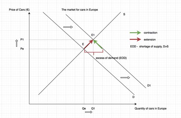
In the diagram the demand and supply for cars in Europe is shown by Pe and Qe which is the equilibrium price and quantity of cars (E). As income tax in European countries decreased, European consumer’s disposable income and their purchasing power increased, leading to more demand for cars in Europe. Government regulation and income are non-price determinants of demand. This causes the demand curve to shift to the right from D to D1 at the price of Pe. This creates an excess of demand (D>S, shortage) which causes an upward pressure on price. As prices are rising, it signals to the producer to extend supply along the supply curve due to the law of supply and the profit motive (incentive). However, an increase in price signals to consumers to buy less and therefore demand contracts along the demand curve due to the law of demand and the income effect (incentive). This leads to a new equilibrium of P1, Q1 whereby prices have risen from Pe to P1 and the quantity of cars in Europe increased from Qe to Q1, rationing cars to the people who now have the ability and willingness.
*As seen, this diagram can be used to help to explain how resources are allocated in a free-market by referring to price mechanism and the price functions (signaling, incentive and rationing).
Section 2: Macroeconomics
USA’s macroeconomic performance
Explanation of the diagram:

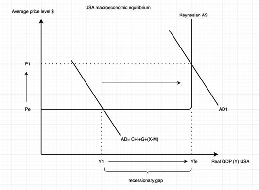
The Keynesian diagram shows the effect of an expansionary fiscal policy on the USA’s economy. If the government decides to decrease taxation (either direct or indirect), then household’s disposable income and/or firms’ net profits increases. This increases household’s purchasing power and can lead to an increase in consumption (C) which is a key component of Aggregate demand (consumption (C) + investment (I) + government spending (G) + net exports (X-M)). Equally, an increase in firms’ net profit can lead to more I, another key component of AD. Depending on the current stage of the economy in the business cycle and confidence level, this can lead to a shift of AD from AD to AD1, increasing the average price level from Pe to P1 and real GDP (Y) from Y1 to Yfe, closing the recessionary gap (Y1-Yfe). So the use of the expansionary fiscal policy stimulated actual growth and decreased demand-deficient unemployment whilst leading to inflationary pressures.
Section 3: International Economics
Exchange rate diagrams:

Explanation of the diagram:
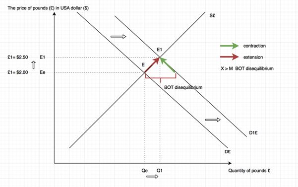
In the diagram the demand and supply for pounds (£) on the forex is shown by Ee and Qe which is the equilibrium exchange rate (E) for pounds in terms of $. British sausages have become more popular by Americans or the Olympic Games took place in London in summer 2012. This means that more pounds were needed to purchase British products. As a result, the demand curve of pounds shifts to the right from D£ to D1£ causing an excess of demand of pounds at the original exchange rate equilibrium (Ee) where £1= $2. This shows that the BOT is in surplus as X>M (disequilibrium) and this leads to an upward pressure on the value of the pounds. The increase in the value of pounds will lead to an extension of the S£ as American products become cheaper for UK citizens whereby the demand for pounds contracts as British products become more expensive for Americans. As a result, a new equilibrium (E1) is reached at £1 = $2.50 showing an appreciation of the pound and an increase in the Q of pounds from Qe to Q1, restoring the BOT to an equilibrium (X=M).
Section 4: Development Economics

Explanation of the diagram:
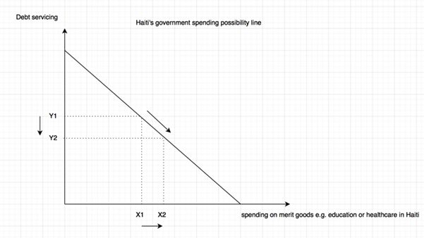
The diagram shows a government’s spending possibility line. If a country like Haiti which is part of the Heavily Indebted Poor Countries Initiative by the IMF and World Bank was granted debt relief, then the government can use the extra revenue and increase government spending on improving the provision of merit goods such as education or healthcare. This means that the government would face less debt servicing costs (Y1-Y2) and increase spending (X1-X2) on merit goods such as education or healthcare, showing less of an opportunity cost for the government. This would help a country like Haiti to overcome key barriers to economic development and potentially break out of the poverty cycle along with creating less outflow of money on net income payment section on the current account (BOP).
References:
Theory:
Tragakes, E. (2012) Economics for the IB Diploma, 2nd edition, UK: Cambridge University Press.
Blink, J. and Dorton, I. ( 2011) E conomics Course Companion, 2nd edition, UK, Oxford Press.
Maley, S. and Welker, J. (2011) E conomics developed specifically for the IB Diploma, UK: Pearson Education Limited.


Hey, what app are you using for drawing your diagram?